Yes, QR codes can be almost any colour. A black-and-white square doesn't have to sit awkwardly on your carefully designed menu or package. But colour is also where many branded codes quietly break. A pale yellow code might look elegant on the proof and then fail on half the phones in a dimly lit restaurant. The good news is that the rules for choosing QR code colors are short: keep the code dark, keep the background light, and leave plenty of contrast between them. This guide explains why, gives you colour pairs to start from, and shows how to test a code before it goes to print.
How phones read colour
A phone doesn't really see your brand colour. To read a QR code, scanning software essentially reduces the image to light and dark, and then decides which modules are which. So what matters isn't the colours as such, but how far apart they are in brightness. A navy code and a dark red code on white behave in much the same way. A yellow code on white is hard to read because, once colour is removed, the two look nearly alike.
A quick way to preview this is to convert your design to greyscale. If the code still looks crisp and clearly separated, the colours are likely fine. If it turns into a mid-grey blur, change them.
The three rules
- Dark code on a light background. This is the arrangement that QR scanners were designed around. Choose your brand's darkest shade for the code.
- High contrast. Dynamic QR Tool warns you when the contrast ratio between the two colours falls below 3:1, but treat that as a floor. Aim for much higher, particularly for print. The ratio itself comes from the WCAG contrast formula, which was designed for web text, not for QR codes, so use it as a guide and not a guarantee.
- Solid colours. Gradients may look good, but the lightest part of the gradient sets your real contrast. Patterns and photos behind a code make it worse.
Colour pairs that work
| Brand feel | Code colour | Background |
|---|---|---|
| Corporate, trustworthy | Navy #1F3A5F | White #FFFFFF |
| Warm, restaurant, wine | Burgundy #7A1F3D | Cream #FFF7EC |
| Natural, eco, garden | Forest green #14532D | Pale green #F0FDF4 |
| Creative, premium | Deep purple #3B1D7A | Pale lilac #F5F3FF |
| Earthy, artisan | Dark brown #7C2D12 | Peach #FFEDD5 |
| Bold, high-visibility | Black #000000 | Bright yellow #FFE14D |
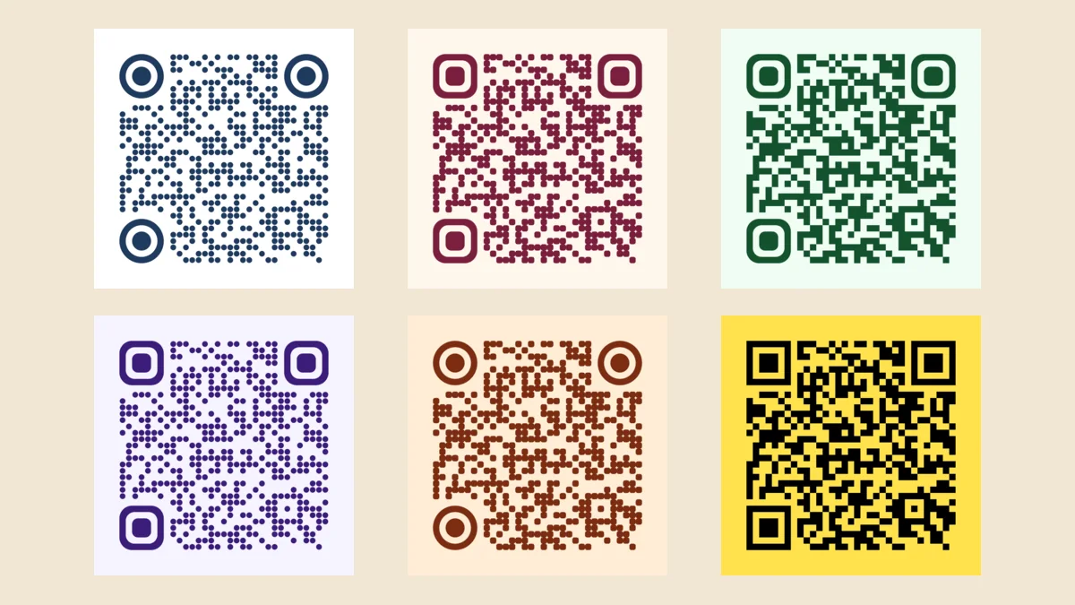
These six are the codes shown at the top of this article. We generated each one on our QR code generator and confirmed that each decodes correctly from the digital file, using Apple's built-in QR detector. A clean file is the easy case, however. It doesn't guarantee a good result on paper, so still test your own print.
Colours that often cause problems
- Yellow, pale orange, light pink or sky blue as the code colour. They don't have enough contrast against a white or light background.
- Red on green or green on red, at similar brightness. The colours look very different to the eye, yet they can be close in brightness. They're also difficult for people with red-green colour blindness.
- Light code on a dark background (inverted). Inverted codes can look striking and many modern phones read them, but older phones and some scanner apps don't. Dynamic QR Tool shows the same warning for these as for low contrast.
- Dark on dark. Navy on black, for example, looks elegant on a dark package and is often unreadable in the real world.
- Metallic ink and foil. Reflections make the same area look bright at one angle and dark at another. Avoid these for the code itself, or use them only for surrounding decoration.
Here's what the warning looks like when a colour pair is too close:
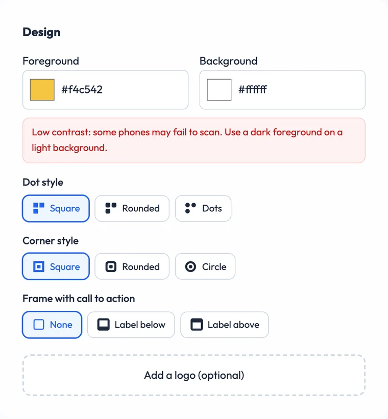
It's worth knowing that we ran three weak pairs through the same detector: yellow on white, white on black, and pale blue on white. All three decoded from a perfect digital file, which is exactly why a test at your desk can mislead you. The risk appears later, when ink, lighting, distance and an older camera all reduce the margin. That's what the warning is for.
A code that scans on your monitor has only passed the easiest test. Choose colours for the worst place it will be scanned, not for the best one.
Where the print process changes your colours
Colours on screen and on paper are not the same, and that can shrink your contrast.
- Screen colours can shift in print. A saturated on-screen colour may print duller in CMYK. Ask your printer for a proof, and check the code on it.
- Paper colour adds up. Kraft paper and coloured stock are effectively a darker background. A dark code can lose a lot of contrast on brown card.
- Uncoated paper absorbs ink. The modules may spread slightly and print lighter than expected.
- Fading. Sun fades outdoor prints and window displays over time, and it can weaken contrast. Check long-running codes occasionally, especially in a store window.
- Low light. Darker settings reduce the difference between shades, so bars and restaurants need stronger contrast than a bright shop.
Other ways to show your brand
If your brand colour is light, such as yellow or mint, don't force it into the code. There are safer places to use it:
- A CTA frame. Keep the code dark, then use your colour on a frame with a label such as "SCAN FOR MENU". The label text is automatically set to stand out against the frame.
- The area around the code. Put a dark code on a white panel, and let the panel sit on your brightly coloured artwork. The panel protects both contrast and the quiet zone.
- Shape styles. Rounded modules and circular corners can make a plain dark code feel designed, without touching the contrast.
- A logo in the centre. A logo brings in your real colours in a small area. Keep it small and test it.
Good examples of this approach are QR codes on product packaging, where the artwork is usually too busy for a code to sit directly on top, and business cards, where a single brand colour often does the job.
How to set colours on Dynamic QR Tool
- Paste your link into the generator.
- Under Design, choose your Foreground (code) and Background colours. Enter your exact brand hex values in the colour pickers.
- Check for the contrast warning. If it appears, darken the foreground or lighten the background.
- If you like, add a dot style, corner style, frame and logo. The preview updates as you go.
- Create the code and download an SVG for print or a PNG for screens.
On a dynamic code, the design and the destination are separate, so you can also change the link after printing. You can edit the design on the manage page too, but you'd then need to export the file again, and anything you've already printed keeps its old colours.
A pre-print colour test
- Convert to greyscale on screen. Is it still clearly dark on light?
- Print a real sample on the actual paper, at the final size, ideally using the same printing process.
- Scan with at least two phones, including an older one, using the default camera.
- Try it in the worst light it'll see, such as evening light at the table or a sunny window.
- Scan from the real distance and at a slight angle, as people will in practice.
Quick answers
Can a QR code be any colour?
Nearly, as long as the code is dark and the background is much lighter. Yellow and other pale colours rarely work as the code colour.
Do coloured QR codes scan more slowly?
A dark, high-contrast colour generally performs like black. Problems come from low contrast, not from colour as such.
Can I use a white QR code on a black background?
You can, and many recent phones will read it, but it isn't dependable across all devices. If you can't test a wide range of devices, go with dark on light.
Does colour affect a dynamic code's tracking?
No. Colour only changes how the code looks. Scans are counted in the same way, provided people can scan it.