When a QR code campaign underperforms, the code usually gets the blame. In practice the code almost never fails on its own. People don't scan because they can't, because they don't see why they should, or because the last code they scanned led nowhere useful. This guide covers the QR code mistakes that quietly kill your scan rate, grouped into design, print, placement and destination, with a quick fix for each. Most take minutes to correct before printing and are expensive to correct after.
Design mistakes
1. Too little contrast
Scanners need a clear difference between the dark modules and the light background. Pale grey, pastel or yellow codes on white look elegant and scan badly, especially in poor light. Keep the code dark and the background light, and don't invert it (light code on a dark background) unless you have tested it on several phones, because some readers still struggle with inverted codes.
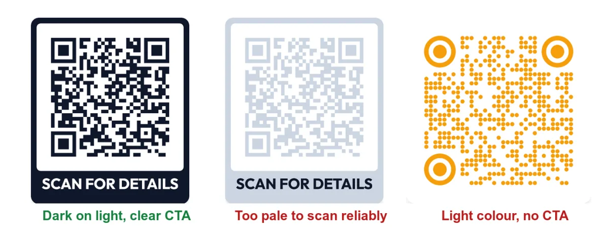
All three codes above were made in the QR code generator on this site. They encode the same link; only the colours and frame differ. The left one will scan quickly in almost any light. The middle one may scan on your screen and fail on paper. For safe ways to use brand colours, see our guide to QR code colours.
2. No call to action
A bare code tells people nothing about what they'll get. A short label such as "Scan for the menu" or "Get 20% off" gives them a reason. Our list of 50 QR code call-to-action examples has labels for every common goal.
3. Over-styling
Rounded dots, round corner eyes and a logo can all work, but stacked together with light colours they reduce the margin a scanner has to work with. If you add a logo, keep it small and centred. Our guide to adding a logo to a QR code explains why.
4. Cutting off the quiet zone
The quiet zone is the empty margin around the code. When a designer crops it to fit a layout, or places the code against a busy photo or a border, scanners can't find the edges. Leave a clear margin on all four sides, roughly four modules wide.
Print mistakes
5. Printing it too small
The most common print failure. A useful rule is that the code should be at least one-tenth of the distance it is scanned from, and not much smaller than 2 × 2 cm even on a business card. The QR code size guide has sizes for each format.
6. A low-resolution file
A small PNG stretched to poster size prints blurry. Use SVG for anything large or professionally printed, and a large PNG only for small items. See SVG vs PNG for the details.
7. Glossy, curved or textured surfaces
Glossy lamination reflects light straight into the camera, curved bottles and cups bend the pattern, and fabric or rough card blur the edges. Choose a matte finish where you can and place the code on the flattest part of the product.
People don't fail to scan because QR codes are hard. They fail because the code is too small, too pale, in the wrong place, or because they don't see a reason to try.
Placement mistakes
8. Putting the code where people can't stop
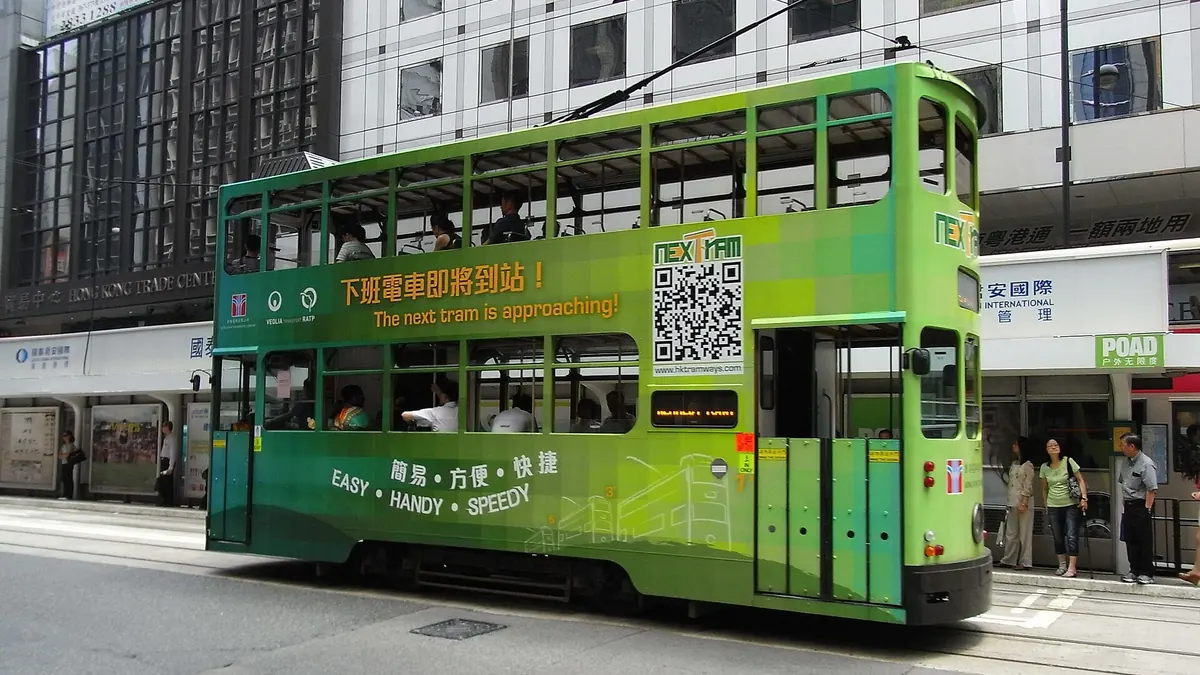
Codes on moving vehicles, motorway billboards or the far side of a busy road are seen by many people but scanned by very few. Scanning needs a few seconds of standing still. For QR codes on billboards, pick locations where people wait: bus stops, station platforms, queues and car parks.
9. Too high, too low or out of reach
On posters and noticeboards, put the code at roughly chest to eye height and close to where people stand. A code at the top of a tall poster or behind a counter forces people to stretch or zoom, and most won't bother.
10. No signal where the code lives
A code in a basement, underground station or rural venue may scan perfectly and then fail to load. If mobile signal is poor, offer Wi-Fi nearby, or make sure the page is light enough to load on a weak connection.
Destination mistakes
11. A slow or desktop-only page
Every scan happens on a phone. If the page is a large PDF, a desktop site or a home page where people must hunt for the offer, many will give up. Link straight to a mobile-friendly page that delivers what the label promised. On flyers, where the promise is usually specific, this matters most.
12. A link that breaks after printing
Pages move, offers end and websites are redesigned. With a static QR code, the link is printed into the pattern and can't change, so a broken page means a reprint. A dynamic QR code points to a short redirect you control, so you can change the link after printing or pause the code when a campaign ends. If you're not sure which type you have, read static vs dynamic QR codes.
How to catch these mistakes before they cost you
| Mistake | Quick check |
|---|---|
| Low contrast, over-styling | Scan a printed copy in dim light with two phones |
| No CTA | Ask someone who hasn't seen the design what the code is for |
| Too small, low resolution | Print at final size and scan from the real distance |
| Wrong placement | Stand where your audience will stand, for a few seconds |
| Weak signal | Load the page on mobile data at the location |
| Bad destination | Open the link on a phone and time how long it takes to load |
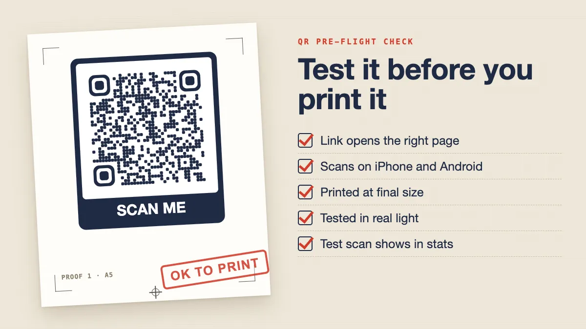
Our pre-flight guide on how to test a QR code before printing walks through each check step by step.
Measure, then fix
A low scan rate is a signal, not a verdict. With a dynamic code, you can see how many scans each code gets, when they happen and which devices people use. If a poster in one location gets far fewer scans than the same poster elsewhere, placement is the likely cause. If every copy performs badly, look at the design and the call to action first. Read how to track QR code scans to understand the numbers.
Fix one thing at a time, compare the results, and keep what works. Most of the time, a darker code, a bigger print and a clear label are all it takes.
Cover photo: "HK Sheung Wan Des Voeux Road Central green Tramways QR Code June-2012" by Adsworldra, Wikimedia Commons, CC BY-SA 3.0.